Tenada: Graphic Design & Logo
- 4.6
- Rating
- 1.00M
- Installs
- Free
- Price
 Analysis by App-foxy
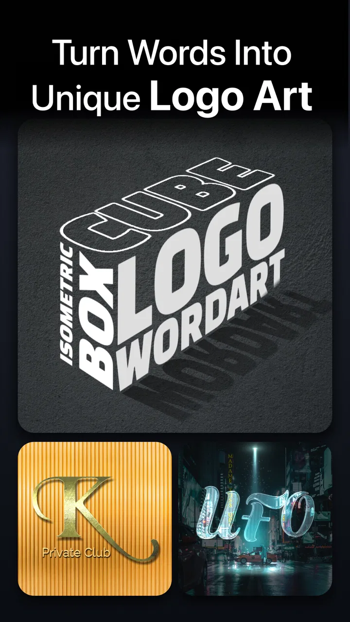
I approached Tenada: Graphic Design & Logo as a quick design tool rather than a full desktop replacement, and that distinction matters. It is an Art & Design app from TENADA Corp. focused on making visual assets directly on a mobile device: logos, animated lettering, posters, thumbnails, intro videos, and typography-based compositions. After using it for the kind of small creative jobs people actually face during a normal week, I found its biggest appeal in speed. It helps turn an idea into something presentable without opening a complex editor or starting from a blank canvas with no guidance.
The app is free to install and suitable for Everyone, which makes it easy to try before deciding whether it belongs in your regular toolkit. Its 4.6 average from roughly 27 thousand ratings and more than a million installs suggest that it has found a broad audience. I would not treat those figures as a guarantee that it will suit every designer, though. The real question is whether you want a mobile-first way to build bold, text-led graphics, or whether you need the precision and flexibility of a traditional design program.
What to consider before choosing a mobile design app
My first decision criterion is the type of work you need to finish. If your goal is a social thumbnail, a channel intro, a simple brand mark, or a poster with strong lettering, Tenada makes sense because its tools are aimed at visually noticeable results. If you are preparing a detailed identity system, a print-ready layout, or a project that depends on exact vector control, I would begin with a more specialized alternative instead.
You May Also Like

 Blood Strike: 2.5 Anniversary
Blood Strike’s Loadouts Turn Every Drop Into a Tactical Gamble
A close look at Blood Strike’s custom loadouts: how fast access to signature weapons reshapes its battle royale rhythm, rewards preparation, and narrows the gap between fights.

 Pandora - Music & Podcasts
Pandora’s Music Is Easy to Start, but Harder to Recover
Pandora’s strength is its low-effort path from a seed to a station. Its weak spot is how much confidence it asks you to place in connection, setup, and quiet recovery.

 8 Ball Pool
 Is Built on Rivalries, Rematches, and Routine
A close look at the rivalries, rematches, shared routines, and unanswered safety questions that turn a quick pool match into a persistent mobile community.

 Samsung Music
’s Quiet Strength Is Playing What You Already Own
Its reach comes less from spectacle than from dependable access to a personal library. That simplicity is both the app’s strongest retention engine and its ceiling.

 AccuWeather: Weather Radar
AccuWeather Review: A Quick, Clear Forecast for Everyday Decisions
For everyday plans, the best forecast is the one you can understand quickly. AccuWeather makes rain timing, radar, and local conditions easy to act on, with a few trade-offs.

 Hill Climb Racing
Why Hill Climb Racing Still Turns Crashes Into One More Run
A tiny car, a bumpy hill and one more upgrade: Hill Climb Racing keeps resurfacing because its simple chaos makes every near-miss feel personal.
More From Our News Desk



The second criterion is how quickly you want to move from idea to export. On a phone, the best editor is often not the one with the longest feature list. It is the one that lets you choose a visual direction, adjust the important parts, and produce a usable result before your attention disappears. Tenada is strongest in that situation. I can imagine using it while planning a post, preparing a small announcement, or creating a temporary graphic for a project that does not justify a long desktop session.
There is also a question of visual style. This app is particularly comfortable with prominent text, dimensional lettering, logos, and motion-oriented assets. That makes it a natural fit for creators who want their words to carry the design. Someone looking for quiet editorial layouts, detailed illustration, or restrained brand guidelines may find the experience less natural. The app can still be useful, but its personality leans toward impact rather than subtle page composition.
Finally, I would consider how often you need to revise the same work. Mobile editors are excellent for producing a finished image quickly, but repeated changes across many related assets can become less comfortable than working in a desktop design system. Before committing to it as your only tool, think about whether you will make one graphic at a time or maintain a whole family of coordinated designs.
A practical first session
My recommended starting point is not a logo. Begin with a simple thumbnail or poster where the main message is only a few words. That lets you learn the editing flow without getting distracted by the pressure of creating a permanent brand symbol. I would test several text treatments, then compare them at the actual size where the graphic will be viewed. A design that looks impressive while zoomed in can lose its clarity when reduced to a small preview.
One useful habit is to decide the message before choosing decoration. On a phone, it is easy to spend time exploring effects because they are immediately visible. I get better results when I first establish the wording, hierarchy, and approximate placement, then use depth, color, and motion to support that structure. This keeps the result from becoming a collection of effects with no clear focal point.
I also recommend making a deliberately plain version before adding extra styling. That version becomes a reference point. If the finished design is harder to read than the plain one, the added treatment is not helping. This is especially important with animated text and dimensional lettering, where movement and shadows can compete with the actual message.
Where Tenada is most convincing
The strongest part of the experience is the way it treats typography as the main visual material. Instead of asking me to build every element from scratch, it encourages a more direct process: choose a text idea, give it presence, and shape the surrounding composition around it. That is valuable for creators who know what they want to say but do not have the time or confidence to construct a complete design system.
Its usefulness becomes clearer in a realistic everyday situation. Imagine I run a small video channel and need a new thumbnail for an upload later that day. I can start with the title, make the key words visually dominant, add a stronger treatment for separation, and create a graphic that feels intentional rather than like plain text placed over a random background. If I later need a short intro-style visual using the same wording, the app’s focus on animated text gives me a more suitable starting point than a basic photo editor.
That workflow is different from using a general image editor. A general editor may offer broader control over photos, brushes, layers, or manual adjustments, but it can leave me doing the repetitive design work myself. Tenada is more opinionated. It pushes me toward a finished, attention-grabbing result, which is exactly what I want when the deadline is close and the asset is meant to be seen briefly.
I also like the possibility of using it for temporary branding. A community event, a small online project, or a short campaign may need a recognizable mark without requiring a full identity consultation. In that case, the app can help me explore several directions quickly. I would treat the result as a practical visual solution, not automatically as the final foundation for every future brand application.
The most useful mindset is to use Tenada as a rapid visual prototyping tool, not as a complete design studio. That approach plays to its strengths. I can try a bold wordmark, a poster direction, or a motion concept, then decide whether the idea deserves more detailed work elsewhere. It reduces the cost of experimentation because I do not need to build a polished system before knowing whether the concept works.
Three workflow details that improve the results
First, I would create a small set of style tests using the same wording. Change only one major element at a time, such as the lettering treatment, color relationship, or background contrast. This makes comparison much easier than creating unrelated designs and choosing whichever one feels most exciting in isolation. It also reveals whether the idea itself is strong or whether one decorative effect is doing all the work.
Second, I would check readability at a distance. For a thumbnail, the design should still communicate when viewed small. For a poster, I would imagine someone seeing it while walking past. For an intro video, I would ask whether the text remains on screen long enough to be understood. These checks are simple, but they prevent a common mobile-design mistake: judging everything at editing scale rather than viewing scale.
Third, I would keep a clean copy before experimenting with more dramatic treatments. A bold effect can be difficult to undo mentally even when the editor allows changes. Having a simpler version gives me a safe fallback and helps me compare the design honestly. This is particularly useful when creating a logo concept, because a mark that works with heavy styling may not remain recognizable when the styling is removed.
Another trade-off is that fast visual results can encourage sameness. When an app makes a certain style easy to produce, many users may naturally move toward similar-looking outcomes. I counter that by changing the wording hierarchy, limiting the number of visual accents, and choosing a color relationship that reflects the subject instead of simply selecting the loudest option. The app can accelerate creativity, but it cannot replace the decisions that make a design personal.
Where another category may fit better
I would choose a general photo editor when the primary material is photography. If the project depends on detailed retouching, careful masking, or extensive image correction, a photo-focused tool is likely to feel more appropriate. Tenada may still help with the title or promotional lettering, but it would not be my first choice for a workflow built around manipulating photographs.
I would choose a vector-oriented design application when precision is the priority. A serious logo project often needs clean shape construction, consistent spacing, scalable artwork, and predictable reuse across different formats. Tenada is useful for exploring a logo direction and producing a visually strong concept, but I would move to a more exact tool when the mark becomes part of a larger professional identity system.
For long-form layouts, a page-design application may be a better fit. Brochures, multi-page documents, menus, and structured editorial work require control over columns, repeated elements, and text flow. Tenada’s appeal is concentrated in individual visual assets, so I would not force it into a role it was not designed to fill.
There is also a case for skipping it if you dislike editing on a phone. Touch controls can be convenient for quick adjustments, but they are not equally comfortable for everyone. If you already have a reliable desktop workflow and rarely need to design away from your computer, installing another mobile editor may add more friction than value. The app earns its place when mobility and speed are genuine needs, not merely because mobile access sounds convenient.
Understanding the free entry and in-app purchases
The free starting point is a meaningful advantage because I can test the editing approach before spending anything. That matters more here than it would with a simple utility, since personal taste plays a large role in whether the visual style feels right. I would make a few different assets, test how comfortable the controls feel, and decide whether the results are useful in my own workflow.
There are in-app purchases ranging from $2.99 to $59.99 per item. That wide range is a reason to be deliberate rather than impulsive. I would first identify the exact limitation affecting my project and only then consider paying for the relevant option. Buying extras simply because they look attractive in the moment can turn a quick design experiment into an unnecessary expense.
For occasional users, the free experience may be enough to create a one-off poster or explore a logo idea. For frequent creators, the value depends on how often the app saves time compared with the tools already available. I would judge the purchase by repeated workflow benefit: does it help me complete several real assets more comfortably, or does it only provide a novelty effect during the first session?
The app is free and carries an Everyone age rating, so it is approachable for a broad range of users. That does not mean every user will find the design process equally easy. Beginners still need to make choices about contrast, hierarchy, and restraint. The software can help shape an attractive composition, but it cannot decide whether the final message is clear for the intended audience.
Compatibility and day-to-day practicality
The current version is 6.4.5 and it requires at least OS 9. I would check that requirement before planning to use it on an older device. On a compatible phone, the main practical question is not just whether it installs, but whether the screen gives me enough room to judge spacing and detail comfortably. A larger display can make design review easier, while a smaller one may encourage me to work too close and overlook how the result reads at normal size.
I would also build a habit of reviewing finished work outside the editor. Look at the image in the place where it will actually appear: a social feed, a video preview, a message, or a poster viewed from a distance. This catches problems that are easy to miss while editing, including weak contrast, crowded lettering, and effects that become distracting when the design is no longer isolated on the screen.
For animated assets, I would pay special attention to the opening and closing moments. A viewer may see only part of a short visual, so the central message should not depend entirely on catching one exact frame. A strong first impression is useful, but a clear ending also helps the asset feel finished rather than abruptly cut off.
Who should use it and who should move on
I recommend Tenada to social creators, small project owners, students, hobby designers, and anyone who regularly needs a bold visual without a long production process. It is especially appealing if your work revolves around words: channel titles, event names, short announcements, promotional phrases, or simple logo concepts. The app’s focus gives these tasks a faster starting point than a blank general-purpose canvas.
I would also recommend it to someone who wants to learn visual hierarchy through experimentation. Because the app makes text treatments immediately visible, it is easy to compare how size, contrast, depth, and movement change the way a message feels. That kind of quick feedback can teach useful design instincts, provided the user pauses to evaluate clarity rather than choosing the most elaborate result.
I would not make it my main recommendation for a professional who needs exact brand production, complex illustration, detailed photo editing, or multi-page publishing. In those situations, the convenience of mobile creation does not outweigh the need for deeper control. I would use Tenada as an idea generator or companion tool, then continue in a more specialized application when the project demands precision.
The cost of changing tools later
Trying Tenada is relatively low-risk because the app is free to install, but changing tools can still have a creative cost. If I build a collection of designs around a particular visual treatment, moving to another editor may require rebuilding the look rather than transferring the whole working process. That is why I would avoid making it the sole home for important brand assets before understanding how well it fits long-term revisions.
For casual graphics, the switching cost is small. I can simply create the next asset in another application if the project changes direction. For a repeated series, however, consistency becomes more important. I would keep notes about the wording, color choices, and visual decisions that define the series instead of relying only on the finished image. That makes it easier to reproduce the idea elsewhere if the project grows.
This is also where the app works well as a first stage. I can use it to test several concepts, choose the strongest direction, and then rebuild the selected idea with a more exact tool if necessary. That avoids spending hours polishing a weak concept. In my view, this is a more realistic role than expecting one mobile app to handle every stage from first sketch to permanent professional identity.
My recommendation after using it
Tenada is a good choice when the decision is between making a strong graphic quickly and not making one at all. Its emphasis on logos, animated text, posters, thumbnails, intro visuals, and typography gives it a clear purpose. I found it most convincing when I needed a noticeable result from a short phrase and wanted more personality than a basic text overlay could provide.
I would install it if I were building social content, testing a small brand idea, preparing a quick event graphic, or creating a visual introduction for a video project. I would start with free experiments, compare simple and decorated versions, and judge every result at its real viewing size. Only after repeated use would I consider one of the in-app purchases, especially given the range from $2.99 to $59.99 per item.
My final view is positive but specific: this is a focused mobile design companion, not a universal replacement for professional software. If you value speed, prominent typography, and ready-to-shape visual ideas, it can become one of the most practical creative apps on your phone. If your work depends on exact vector construction, detailed image editing, or complex document layout, choose a specialist tool instead and use this only for quick concepts.
For the right person, that focus is precisely the reason to try it. TENADA Corp. has built an app that makes short-form visual creation feel approachable without limiting it to plain text and basic filters. I would recommend giving it a real test with a project you genuinely need to finish, rather than judging it from a few decorative samples. If it helps you move from a rough idea to a readable, useful graphic in less time, it has earned a place in your workflow.
FAQs for Tenada: Graphic Design & Logo
01What is Tenada: Graphic Design & Logo used for?
Tenada is a mobile graphic design app for creating logos, social media posts, flyers, posters, invitations, thumbnails, business materials, and other visual content. It combines editable templates with text, image, shape, and background tools, making it useful for beginners, small businesses, creators, and anyone who needs to produce polished designs directly from an Android or iOS device.
02Is Tenada suitable for beginners without graphic design experience?
Yes. Tenada is designed around ready-made templates and straightforward editing controls, so users can start with a layout instead of building a design from scratch. You can usually replace text, adjust colors, add images, and rearrange elements with simple touch gestures. However, creating a professional result may still require patience, especially when aligning objects or customizing more detailed logo designs.
03Does Tenada: Graphic Design & Logo offer free templates and editing tools?
Tenada includes free design resources and basic editing features, but the exact selection may vary according to the app version, platform, region, and current subscription policy. Some templates, graphics, fonts, or advanced tools may be marked as premium. Before exporting a project, check whether the chosen elements require payment, because changing a premium item may be necessary if you want to finish the design without subscribing.
04Can designs created in Tenada be used for business and social media?
Tenada can be practical for business cards, promotional graphics, social media content, branding concepts, and other commercial materials. Nevertheless, users should review the licensing conditions for individual templates, stock images, fonts, icons, and other assets before using a design commercially. A template can be visually suitable for a business while still having restrictions on resale, trademark registration, or exclusive logo ownership.
05Does Tenada work offline, and how can finished designs be exported?
Some editing functions may remain available without a continuous internet connection, particularly when working with downloaded or previously loaded resources, but online access may be needed for templates, cloud-related features, advertisements, or premium content. Export options can depend on the project and app version, commonly including image formats such as PNG or JPG. Check the export screen for resolution, watermark, and subscription limitations before saving.
Pros
- Simple tools make quick social posts and flyers easy to create.
- Includes templates for logos
- banners
- invitations
- and promotional graphics.
- Text
- color
- and layout elements are easy to customize.
- Useful for small businesses
- creators
- and users without design experience.
- Export options make it convenient to share finished designs online.
Cons
- Many attractive templates and assets may require a paid subscription.
- Some designs can feel repetitive or too similar to popular trends.
- Advanced editing controls are limited compared with professional design apps.
- Large projects may feel slower on older phones or tablets.
- Watermarks or export restrictions may apply to selected free content.

Tenada: Graphic Design & Logo
Gallery